Viscosity printing on laser etched woodblock ?

Here I found a lasercut piece of mdf that was hanging around the workshop, and I thought I could use it to try a multi colour print.

It was engraved by the laser so I could of just inked it with a roller and printed, or printed it like an intaglio print. As there were different levels to the engraving I thought I would blend the techniques.

And at the time I thought I was doing viscosity printing but doing more research after, I did it slightly differently to the general way you apply ink in viscosity printing.

Viscosity printmaking is a way of applying different coloured ink onto the same plate, utilising the way ink will react to each other if they have different viscosity (thickness or oilyness)

Here is the plate after I had scraped yellow ink into it, as you would an etching or collograph plate. Yellow ink or at least the etching ink here is naturally runnier than other pigments, I don’t think I altered it with anything, thinking as it was going to be the lowest inked bits it wouldn’t matter ( not quite right!)

Then I wiped it with scrim…

Then I mixed an orange ,

I applied this layer of colour with a soft neoprene roller, the idea being the soft roller deposits the ink on some of the lower areas. When I rolled it over though, the orange covered most of the yellow I could see! Anyway I carried on with my next colour.

Contrasting pale blue I thought would pop out, and the idea behind viscosity printing is the layering of colours without them blending, so this colour would be a good test of that thought I.

Here is the plate before I rolled the blue on, which I made a stiff ink , by adding some chalk to, or magnesium carbonate works as well.

When I rolled the blue on with a firm roller, it did not stick very easily , because I had got the order muddled up. A stiff ink wont stick to an oily ink , but oily will stick to stiff.

Either way , into the relief press it went. I used damp paper and some felt blanket for a soft packing so the paper would be pressed into the blocks low places.

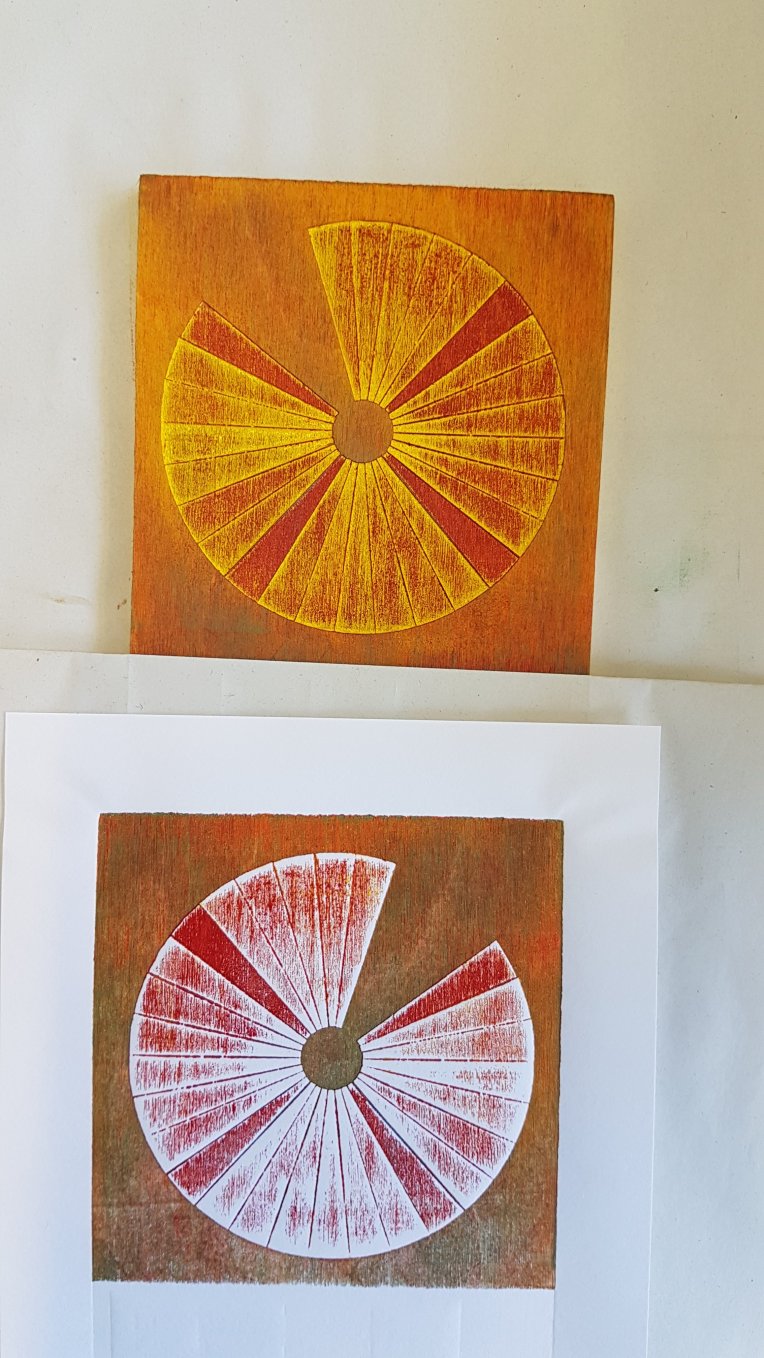
Here is one of the prints I took. I like the way the ink had blended on the highest points, but that wasn’t what I was going for. But cutting myself some slack, the ply wood had a textured surface so it wouldn’t have been a solid colour whatever I did perhaps .

It was an interesting block to ink up, and I learnt a lot about layering ink by doing it wrong and I’ve almost remembered the mantra stiff wont stick to oily… I think..

Thanks for reading, happy printmaking.

Two sparrows update

Browsing through pinterest I found a linocut image that struck a cord , an image that you wish you had made. 

It was by an artist called Sherrie York, whos amazing blog brush and baren , I started reading .

I discoverd a technique called masking for lino printing, which inspired me to have another look at my Two sparrows print from a few months ago , and keep adding colour to it till I was happy, as Sherrie York seems to do.

Here is it with two more layers of ink , the green needs building up to make it bolder

Check out my instagram account where I post Wip pics. @alisonsloggett

Pilgrimage , Salmon

dscf4454dscf4450dscf4448

This was my unique Lino and monoprint, called Pilgrimage, for an exhibition of the same name shown at Gloucester Cathedral , a beautiful place for an exhibition .

This print I took  the theme pilgrimage and the first thing that came to mind was salmon going back up river  to spawn. So I lino cut my slamon , printed several of him, some on tissue paper, then monoprinted the background , and then using rabbit skin glue as it is neutral and I know it doesn`t show  too much, I pasted layers together with several of my salmon just staggered to give a sense of depth . then popped him in a box frame and mounted him so the warped and cockled paper hung suspened .

Altered Books Project

Shakespeare meets ink in the text block Inked Page

Part of an ongoing project with the Artists book club that I am a member of , we are altering books then handing them back in for someone else to continue altering.

This was a copy of Shakespeare’s Twelfth Night , which I thought would look nice with ink liberally splattered, as I was applying it, it made some of these rather pleasing images  …

Inked pages Inked pages

Westonbirt collaborative piece

I am Working on this very large piece, for my Westonbirt exhibition.

It will be made up of lots of little drawings that I gathered from visitors to westonbirt in a week in April.

Visitors drawings

I asked them to draw their favourite part of the tree or a part they found interesting.

Now I am going to put them all together hopefully to make a whole tree out of the parts they have drawn.

.three sheets of A1, and ink

Detail of ink

Detail of ink

Detail of ink

These are some images of the first stages, I wanted a bit of colour in there  so the background will be inked in the shape of a tree, the pics above are some of the details of the ink, which I have been letting do its own thing up to a point, to create interesting marks and layers !

https://alisonsloggett.com/exhibition/